
For my Deconstructions of newspapers i picked to deconstruct the two local newspapers Get Reading (formerly the Reading Evening Post) and the Reading Chronicle in order to judge what the layout and colour scheme my newspaper should follow. The standard codes and conventions of a newspaper are usually a banner along the top with the name, date and price of the newspaper followed by the main headline story. It is interesting to notice that for both newspapers, the main picture in the centre of the pages are not related to that papers main headline. This isn't a compulsory layout feature as sometimes these newspaper do print front pages where the headline and picture go hand in hand, and it is that layout i will use on my newspapers front page.
In the Reading Chronicle, there is a row of adverts between the top banner and the main image. This is a good tactic as they can promote new shops or branches being opened in the local area and/or can advertise a small local business as people believe in the strength of the local businesses. The colour schemes are similar as they both use blue as a major colour, this is because Reading is in a royal county and the Reading Football Club's colours are blue and white so blue is used for recognition of the paper.


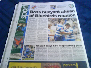
Here are the back pages of the newspapers. I have chosen to deconstruct the back sport part of the papers as my newspaper will be a sport based newspaper so it is important to see how the sport sections are produced in each paper. They both show Reading FC as the main focus but show London Irish rugby club by giving headlines about the rugby team followed by 'more on page___' they both also have an advertising banner along the bottom of the page. This like the banner on the front page gives a chance to advertise local businesses who may sponsor the newspaper. It is also easily noticed that both pages have a second smaller story on the left hand side (Get Reading) and the bottom (Reading Chronicle), this shows that the main story isn't necessarily the only important story for the consumer to read.
It is important to be aware of the fact that local newspapers do also publish some national news, even tho it is very limited. The local newspaper is a newspaper for local people, so a mixture and variety of news is needed to keep everyone involved, as different readers are interested in different segments and pullouts in a newspaper.
Doing this deconstruction i have learned that for my newspaper i will need to use the Reading FC general colours of blue and white, i will have to have the standard layout like a top banner, along with a headline, and a main picture, whether it is relevant to the headline or not. Also when producing sport pages i should show more than one story on a page otherwise it is just a book.
For my ancillary tasks i did brief deconstructions. I looked at different newspaper billboards in local supermarkets like ASDA and TESCO. Below is an example of these newspaper billboards. As you can see it is a simplistic design and layout and only advertises the main headline of the newspaper. However i don't wish to do a poster like this but do a competition poster, which also advertises the newspaper- and could be suitable to be printed in a magazine.
For the radio advert i didn't do a real deconstruction but i used previously heard radio adverts to build a small portfolio to know what conventions my radio advert must follow.


 Here is the script for the secondary tasks.


